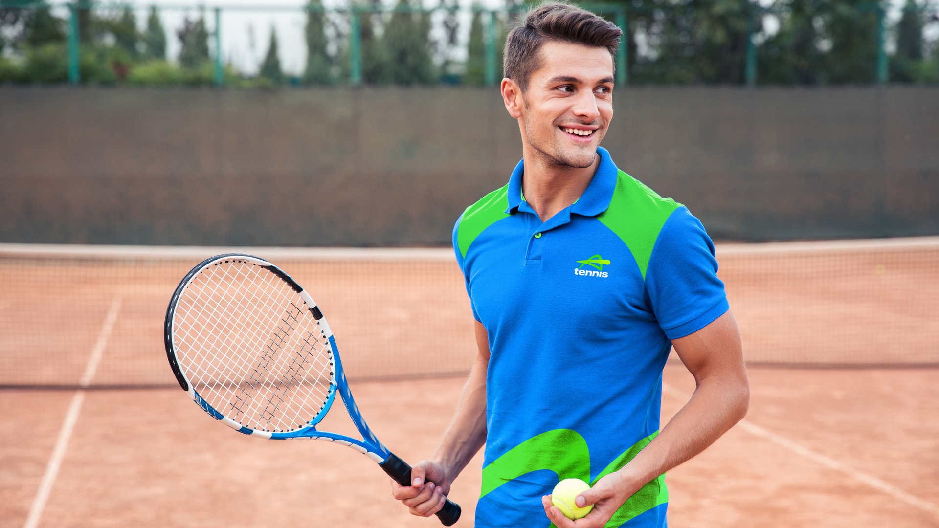
A playful world of tennis
Tennis Australia
Tennis Australia, in partnership with its member state and territory associations, promotes and facilitates the national participation and development of the sport for amateur play and tennis programs at all levels.
The repositioning and rebrand included a refreshed Tennis Australia masterbrand and a simplified, consistent tennis participation brand portfolio for its sub brands: including the children’s tennis program Tennis Hot Shots, fitness focused Cardio Tennis, and racquet-based ball sport Padel.
Creating one sport
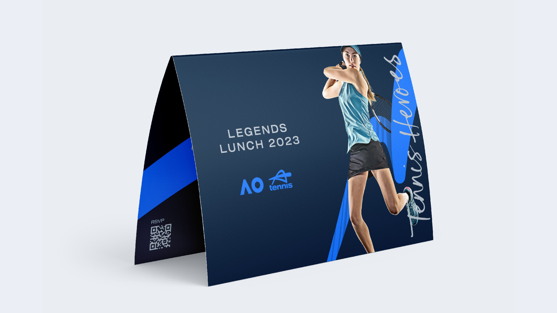
The redesign of the participation portfolio strengthens the connections throughout the wider Tennis brand architecture and visually connects all Tennis brands and products as ‘one sport’, unified to maximise communications, drive visibility, simplify use, and build future growth of the sport.
Evolving an iconic brand
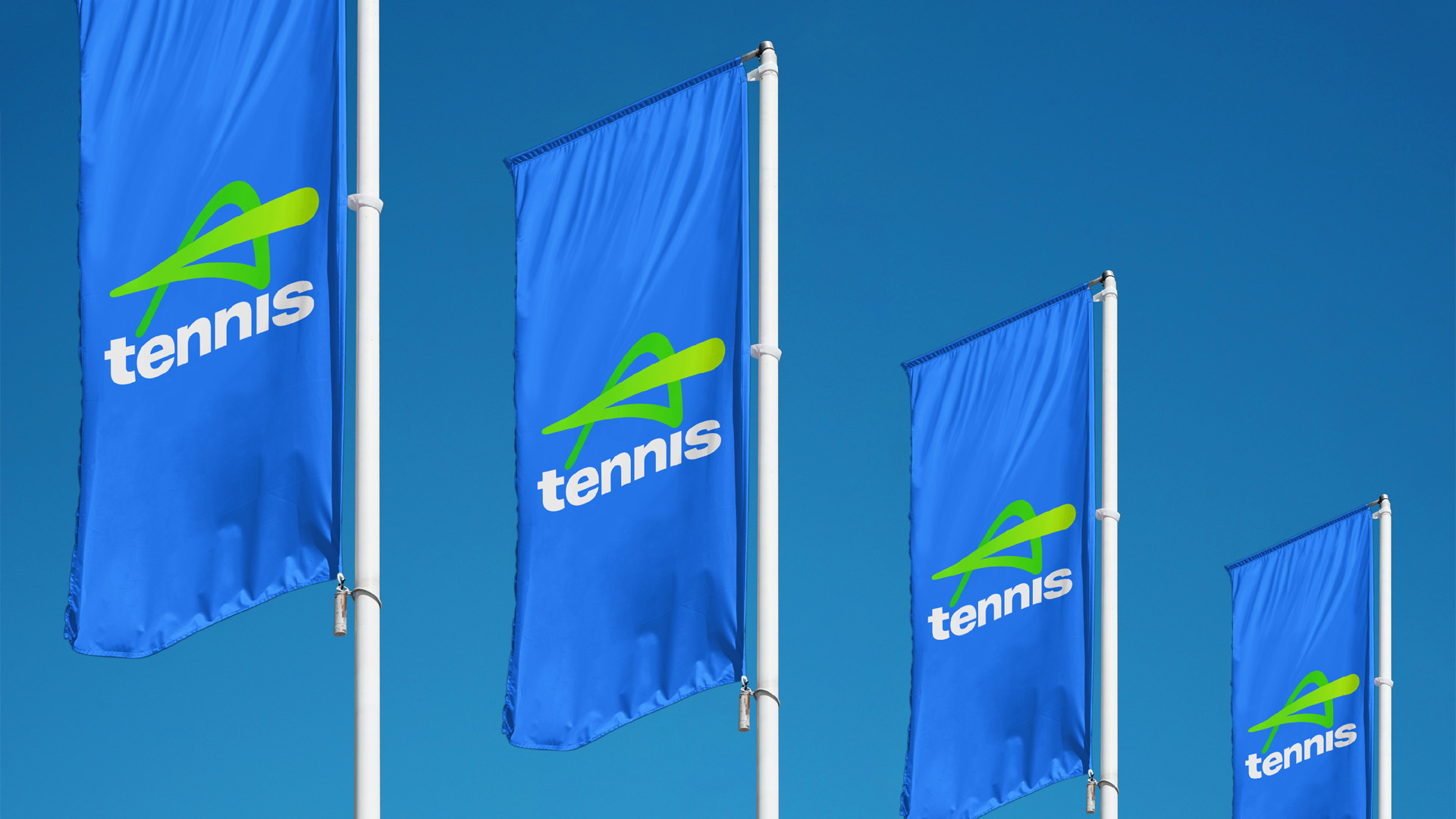
The new evolved visual identity honors the rich history of tennis, leveraging the core colour most associated by Australians with tennis: the distinct ‘blue’ of tennis courts.
Alongside a striking sense of energy, vibrancy and movement, the creative outcomes offer brand consistency and versatility for its role as an external endorser of the game and application in a wide range of environments.
Project Scope
Brand portfolio and architecture
Identity design
Logo creation
Brand guidelines
Implementation and rollout
Digital design and application
Internal engagement campaign

‘Tennis Australia is thrilled to embark on this transformative journey that will allow us to drive further engagement for the sport.’
Tom Larner
Chief Tennis Officer at Tennis Australia

‘Hulsbosch has delivered a fun, energetic, playful look for our sport.’
Craig Tiley
CEO, Tennis Australia