The secrets of great branding
Feature by Peter Gearin
It’s the ultimate in corporate communications: how businesses use motifs and colours to define what they are and what they stand for.
When Qantas announced its rebranding efforts in 2016, there seemed to be only one question on everyone’s lips: what happened to Skippy’s arms? Superficially, the Australian airline’s costly marketing exercise included only a few changes: a new logo with a streamlined kangaroo motif, a change to a bespoke typeface and the addition of a “premium feel” silver band on the rear of its planes. Qantas said the updated livery and kangaroo designs, just the fifth major change since the logo first appeared in 1944, coincided with plans to introduce the new Boeing 787-9 Dreamliner. “A fresh brand helps symbolise the new era Qantas is entering as we head towards our centenary,” said Qantas CEO Alan Joyce at the time. Renowned Australian industrial designer Marc Newson oversaw the new look in partnership with design agency Houston Group. Australians took to design websites and social media to react to the changes. Some liked the new font, but most conversation was about the ultra-streamlined kangaroo. “I would love to say that I love its curves and shading because clearly effort has gone into it but I’m not feeling it at all,” wrote “Armin” on the underconsideration.com website. “What kind of kangaroo doesn’t have arms?” one asked on Twitter. “HOW WILL IT BOX?”
Branding fundamentals
Hulsbosch is one of Australia’s leading corporate brand and design agencies. Founder Hans is an industry icon, having been credited with pioneering the concept of branding in Australia through combining strategic corporate advice with design and advertising. The Sydney-based company has a stellar list of clients, including Woolworths, Virgin Australia, Royal Caribbean and Football Federation Australia. Qantas has been perhaps its most famous customer: Hans created the airline’s flying kangaroo logo in 1982 and its update in 2007. Hans’s youngest son, Jaid, is a Hulsbosch director and a fervent believer in the power of corporate branding. “People say good branding is consumers’ intrinsic understanding of what it is that a company is about and what that company offers,” Hulsbosch says. “For us, it’s about communicating a company’s vision and values, and its products and services, in a simple, innovative and direct way.” He says effective branded needs to do one thing above everything else – automatically communicate to consumers what that company’s about, what it delivers and what they will get from it. “When you see that [Qantas] kangaroo, you automatically get ‘Australiana’. Or when you see the Woolworths ‘W’, you automatically get that business is all about fresh food. Or when you see the MLC nest egg, which we did in 1996, you automatically go, ‘That business is all about wealth creation’. “That’s how we go about creating logos that best represent the brand. But then, the brand is much more than just a logo.” Hulsbosch says what must underpin any corporate rebranding is a desire for change. “A business will come to us and say, ‘we’re looking for a change in perception’,” he says. “The brand repositioning is there to support the business change or the business need, and to articulate to consumers where that business is going and what they [the customers] need to do.” He says that often the only way to signify this shift is to change all of the ways a company communicates. “It’s not just about signage – it’s the digital communications, business cards, advertising hoardings… it’s also the photography style, the tone of voice and the messaging.” Crucially, he says, the change in tone and style of internal communications is just as important as what customers see. “Businesses need to ensure that their people are on board and are living and breathing the brand,” he says. “If that doesn’t happen, it’ll fall over.” A change for change’s sake – or putting “lipstick on a pig” – almost always never works the way a brand expects. “Before looking internally or externally, the business needs to make sure that it’s actually doing different things,” Hulsbosch says. “Otherwise, if you go through the whole process and it’s still the same, consumers will see straight through it.” It’s just as important that companies contemplating a new look listen to their audiences, who might not be ready for their favourite brand to tweak its image. A case in point is clothing company Gap, which updated its look in 2010. It changed its familiar logo of three capital letters on a blue background to an upper-and-lower-case “Gap” with a small blue square in the right top corner of the brand name. “A wave of protest to ‘change it back’ broke loose on Facebook and Twitter, resulting in Gap’s brand president Marka Hansen reversing the decision,” reported website Innovation Enterprise. “As Sagi Haviv, a partner at New York graphic design firm Chermayeff & Geismer & Haviv, pointed out: ‘Gap’s original logo was loved by its audience, but it didn’t know it’.” It didn’t help that the new logo was seen as “uncool” – not good for a fashion retailer. Slate’s Tom Scocca said: “It looks like the emblem of some failed low-fare spinoff of a major airline”.Gap’s new logo lasted just one week.
What’s in a logo?
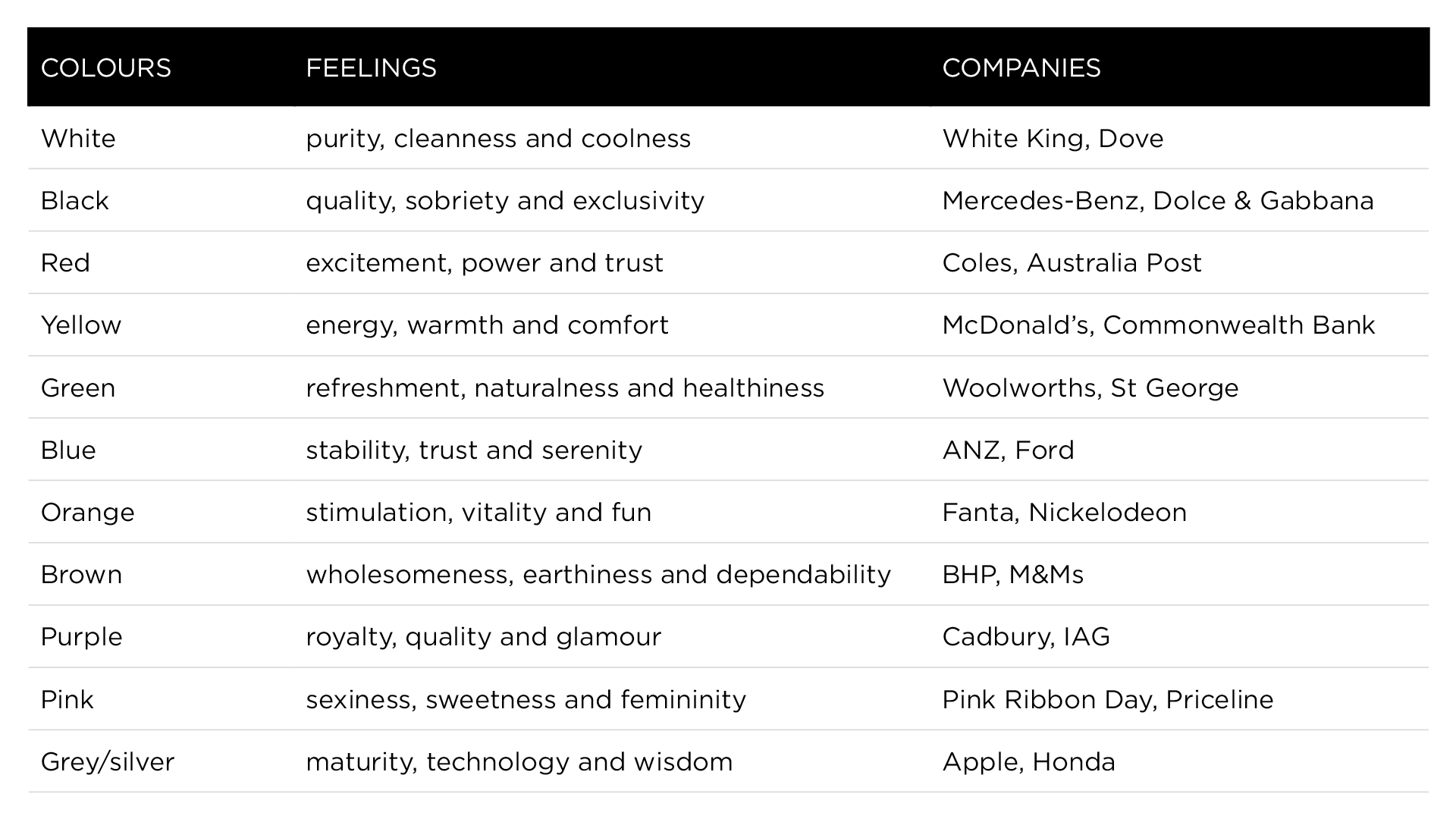
Logos are clearly the centrepiece of any corporate rebranding. Such as in the case of Qantas’s missing kangaroo limbs, they are the most obvious, and most keenly debated, part of any business identity. As US researchers in 2013 found: “a good logo can be a synthesizer of a brand that is readily used by customers for identification, differentiation and positive associations”. The study of 77 large US brands involving 450 respondents found that when a logo can “express a brand’s symbolic, functional or sensory benefits” it can have “a significant impact on customer commitment and company performance”. “Logos offer a frequently untapped opportunity for companies to communicate and symbolise a brand’s essence to consumers, thereby building closer relationships with them, creating strong positive emotions and facilitating top-of-mind recall.” Other researchers have taken this idea further, and investigated the influence of colour when companies communicate with consumers. Brazilian graphic designer Paula Rupolo set up an experiment, exposing a group of people to competing brand logos that had their colour schemes swapped. “When you switch to a competitor’s colours, your brain notices there’s something that doesn’t fit, that makes you go, ‘What’s going on here?’ and that’s interesting and a bit curious,” Pupolo reported in 2013. “Colours are the first thing you notice in a logo, what gets fastest to our brains. Then you read a logo’s shape, icons or typography.” Singapore-based Neil Gains, author of Brand esSense: Using Sense, Symbol and Story to Design Brand Identity, writes of the 11 most frequently used corporate colours and their hidden messages. “Colours are powerful weapons in any branding toolkit and rich with meanings,” he says. (See table below)
Rebranding in action
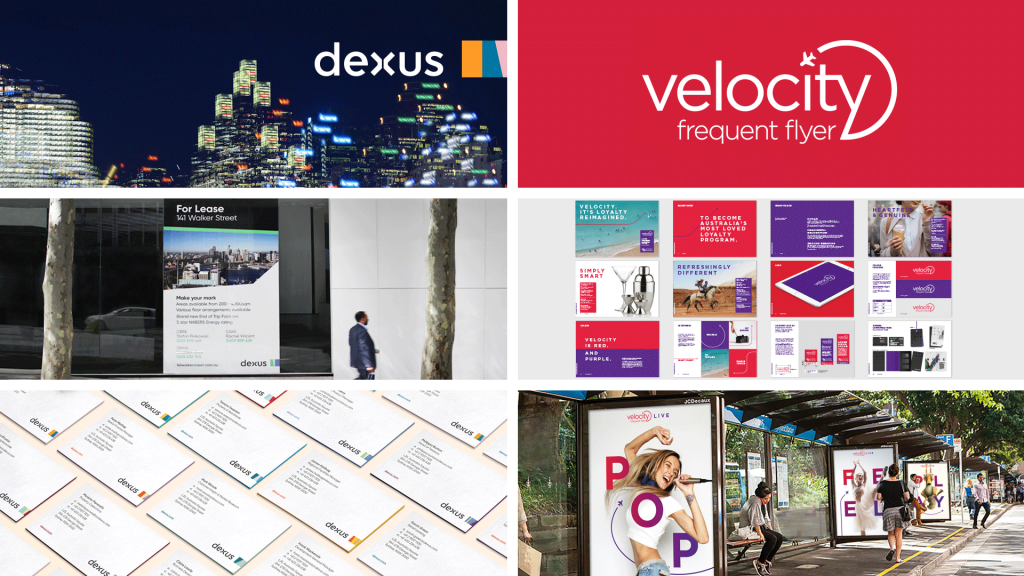
Two Hulsbosch clients – Virgin Australia and large property group Dexus – recently released the results of their rebranding work. Virgin’s frequent flyer program gained a new look that is about “bringing the Velocity positioning to life”. “They needed beautiful, elegant and simple solutions to showcase who they are,” Hulsbosch’s Clare Bailey says. “Bold and engaging concepts integrate Velocity’s brand values, personality and essence. The impactful design elements create a look and feel that is uniquely Velocity and leverages the spirit of the global Virgin brand.” The Dexus rebranding, says Jaid Hulsbosch, was much more significant and brave. The company leases and sells properties to big clients but now understands that its clientele aren’t just CEOs – it also needs to appeal to those who work at companies looking to move. It came to see that employees play a big role in determining where companies should lease working space, and that a “Dexus building” needs to be distinctive. Dexus realised it had to be seen as more than just a B2B property company – it’s also now “B2B2C” (business to business to consumer). “That is ambitious,” Hulsbosch says. “People don’t see Dexus as a consumer-facing brand or a consumer-orientated business. So to change that whole perception, I mean, that’s very, very exciting. It’s a massive challenge but one that is absolutely needed. And once that B2B2C positioning is realised, [Dexus’s] competitors are going to have to catch up.” Hulsbosch says there are ultimately two keys to rebranding success. “What we do is create communication that’s simple and easy for a consumer to understand. [It’s about] simplicity in message; the consumer really gets and understands what that business is trying to communicate. Then [it’s] about the consistency of that message across all the different touchpoints. “Those two things, simplicity and consistency, are what make a great brand.”
Here are the colours, what you might feel when you see them and the familiar companies that identify with them: